Analyze work in progress, measure lead times and cycle times, make data-driven forecasts, evaluate workflow efficiency with TopLeft's Integration with Nave.

img02

Key Benefits

AGILE AND KANBAN ANALYTICS

AGILE AND KANBAN ANALYTICS

Get to the heart of your workflow with metrics that matter. Nave's integration with TopLeft brings you closer to your team's performance, revealing valuable insights into cycle times, workload balance, and productivity.

BOTTLENECK IDENTIFICATION

BOTTLENECK IDENTIFICATION

Zero in on what's slowing you down. Nave's sharp analytics cut through the noise to highlight inefficiencies, enabling you to smooth out kinks and keep your projects flowing seamlessly.

VISUALIZATION

ENHANCED PROJECT VISUALIZATION

With customizable Kanban boards, you create a clear, focused view of every task, ensuring everyone knows what's next and nothing falls through the cracks.

ACTIONABLE INSIGHTS-1

ACTIONABLE INSIGHTS FOR GROWTH

Turn insights into action. Nave's detailed analysis provides a roadmap for continuous improvement, encouraging a culture of excellence and quality in your operations.

Nave Visualization

Nave primarily provides visualizations and analytics tailored for A gile and Kanban methodologies, helping teams monitor and optimize their workflows. Here are some of the specific types of visualizations that Nave offers:

ic1

CUMULATIVE FLOW DIAGRAM

This is a key visualization in Kanban and Agile methodologies. A CFD shows the amount of work in different stages of a workflow over time. It helps in identifying bottlenecks and understanding the flow of work, enabling teams to manage their work in progress effectively.

Cycle Time Scatterplot

CYCLE TIME SCATTERPLOT

This chart  uses the cycle times of all tasks completed within a specific time frame to give you a probabilistic task completion forecast.

Cycle Time Breakdown

CYCLE TIME BREAKDOWN CHART

This chart displays the total time that you needed to complete your work split by process state.

Cycle Time Histogram

CYCLE TIME HISTOGRAM

This chart shows the frequency distribution of the completion times of the tasks in your workflow. It also uses past cycle time data to forecast likely delivery times.

ic4

AGING WORK IN PROGRESS (WIP)

This visualization helps teams see how long items have been in progress and identify items that may be stuck or taking longer than expected. It's essential for managing work in progress and ensuring a smooth flow.

ic3

THROUGHPUT RUN CHART

Throughput, the number of items delivered in a given time period, is visualized in this chart. It's useful for tracking team performance over time and forecasting future productivity based on historical data.

Throughput Histogram

THROUGHPUT HISTOGRAM

This chart shows the shape of your throughput frequency distribution. Additionally, you can assess your team performance by evaluating the average number of tasks that were completed in a day, week or month.

ic7

FLOW EFFICIENCY CHART

This chart visualizes the ratio of active working time to total time taken for an item, helping teams identify and reduce wait times in their process.

Due Date Performance Chart

DUE DATE PERFORMANCE CHART

This chart enables you to evaluate your due date performance by comparing the time between the start date and due date of a task with the actual time it took to deliver your work.

ic5

MONTE CARLO SIMULATION

Nave uses Monte Carlo simulations to forecast likely completion dates for projects or sets of work items. This probabilistic approach helps in setting realistic expectations and planning based on historical data.

See why TopLeft is the top choice for MSPs

Join over 180 IT Service Provider using TopLeft to gain visibility, remove bottlenecks, and reduce costs
img_too_left
Steve Psaradellis - CEO of TEBA - AU

We were able to move our average project delivery from negative efficiency to positive 33% efficiency. So we finish projects now with an average of 1/3 time left over!

TopLeft is an extremely affordable investment, considering the costs of switching PSAs and the efficiency improvements.

Judi Noell Baker - Sevice Desk Manager, Seitel Systems

We see value in using TopLeft.

We have seen firsthand how it has helped us visualize our workflows, identify bottlenecks and continuously improve our processes.

We've even brought in new team members who were able to rapidly get up to speed with TopLeft.

Frank Hannaford - Solutions Architect at CoreTech

Straight-forward implementation of Kanban for Project Management that is fully integrated with ConnectWise PSA!.

We manage a lot of Projects (40 - 60 at a time) and TopLeft has proven to improve focus and save time capturing critical information needed to keep projects on schedule!

Scott Patsy - Manager of Strategic Engagement at CIT

The big AHA moment was when I could click on the magnifying glass on a project drill into the tickets for the project. OH MY GOSH.

As a project manager I see my own projects- but to talk w/ clients you need to know about the individual tickets. It gives project managers a better way to manage project milestones.

Sarah Ellis - CIO at Clear Guidance - Austin, Tx

TopLeft turned project management from staring at huge lists, impossible to prioritize, into easily digestible, very visually compelling information.

We are no longer looking at a mountain of data wondering how to break it up. It’s already broken up for us by TopLeft, which makes it much easier to see the flow of tickets.

Before, we also weren’t able to see projects side-by-side—something we can now do thanks to TopLeft.

Provides data-driven way to easier track your projects.

nave-red

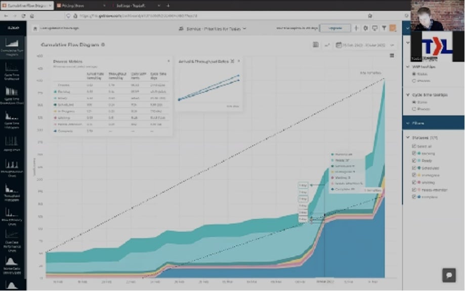
Ready to take a flow-based Kanban approach to improving project performance? Gantt charts can be utopian and dreamy but not reflect reality. The best way to predict and improve future performance is by understanding what is currently happening. Try out Nave with a free trial!

Ready to proceed with the integration?

REQUEST A DEMO