What is the ultimate goal behind implementing WIP limits?
Usually, teams only start thinking about introducing this practice the moment they realize that their work has become unmanageable.
Their boards are brimming with tasks, customer requests keep coming in, and they are constantly switching the context trying to cater to everyone’s demand. The question “when will this be done” becomes impossible to answer without compromising their credibility.
If this sounds familiar, applying a limit on the amount of work that your team handles at any given time will be a game-changer. This practice enables you to move the focus from starting more new work to finishing outstanding work. It gives you all the means to significantly improve your delivery speed.
But how would you measure the impact of implementing WIP limits in the first place? When you’re just getting started, how do you know whether or not it’s working?
During the Transition, Your Positive Results Might Be Hidden
Once you put this practice in place, the ultimate goal is to decrease your delivery time. This result is also backed up by the relationship between the main flow metrics, as exposed by Little’s Law. The law states that limiting WIP will most certainly reduce your cycle time.
And the Cycle Time Scatterplot plays a crucial role here.
This chart visualizes all your completed tasks as dots scattered on a plot. Each task comes with the finished date and the time it has taken to complete.
Here is the thing, the traditional visualizations of the scatterplot use your items finished date as the value on the X-axis.
Why is this important?
When you apply WIP limits for the first time while your board is still overloaded with work items, the immediate effect of implementing WIP limits won’t be visible until you stabilize your system and release all the aging work.
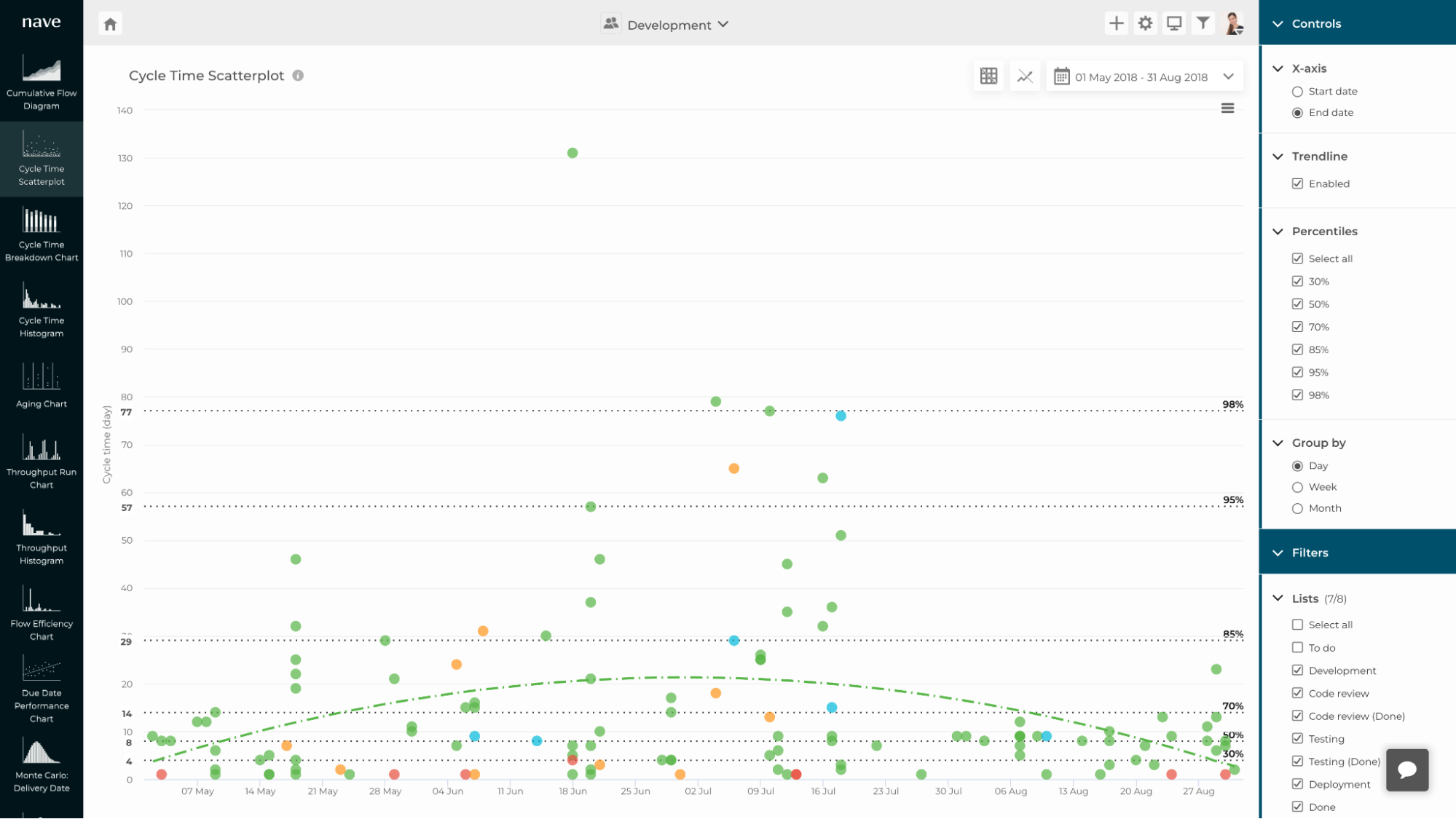
Let’s look into the following example. This is the Cycle Time Scatterplot of a development team who were struggling to deliver on their commitments.
At the end of June, they introduced the practice of WIP limits and when they analyzed their charts a few weeks later, they were not delighted by the results.
In the period between the end of June (when they first implemented WIP limits), up until the end of July, their cycle times actually remained very inconsistent and even went up.
Here is why this happens. The items that appear on the chart with a very high cycle time are the aging items they have released. These items had already been started at the moment they adopted the practice.
They were not a result of implementing the practice, they were an after-effect of the unmanageable amount of items the team had already been handling by the time they initiated their change management initiative.
And with the traditional Cycle Time Scatterplot that visualizes your completed work items by end date, the immediate effect of implementing WIP limits will remain hidden.
So, how can you expose the positive results of this practice, to spark motivation and engagement?
How to Reveal the Immediate Impact of Implementing WIP Limits
There is a very simple trick that you can apply to be able to reveal how limiting your work in progress immediately improves your performance.
Instead of visualizing your data by end date, organize it by start date.
If you’re using Nave, you can just select “Start date” on the X-axis configuration on the right sidebar of your chart.
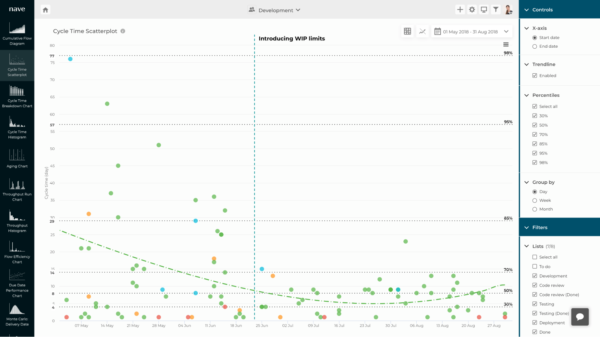
Looking into the Cycle Time Scatterplot organized by “Start date”, it became crystal clear that their delivery system was actually behaving in a very predictable and consistent manner right after the implementation of WIP limits.
You can see that the items that have been started right after the team introduced this practice have been finished in a much more consistent and predictable manner.
Before the change, their cycle time varied significantly. Now, once they focused on finishing their work before starting new work, the percentiles moved very close to each other, which is an ultimate indicator of good predictability.
Furthermore, their completed items were positioned below the 70th percentile which means that they can now commit to delivering any type of work within 14 days or less with very high confidence.
When you’re just starting out with your change initiatives, visualizing your analytical charts based on end date could be misleading.
Instead, switching to start date can give you the insights you need to understand whether your improvement efforts are actually paying off. Then, use that visualization to spark a conversation around the behavior of your delivery system.
And if you’re struggling to make reliable delivery commitments and hit your targets consistently, I’d be thrilled to welcome you to our Sustainable Predictability program.
Always remember that, without the context behind them, the charts are just pictures. The most important part of the process is to understand the meaning behind your data. Own it, embrace it and learn from it.
* The implementation of this feature was inspired by the work of the one and only Ivo Gueorguiev
This post is republished with permission from Nave. Nave uses data from TopLeft to make agile charts for analyzing workflow efficiency and identifying areas for improvement in your team. Learn more here.