How can you leverage your Kanban analytics to make the most out of your improvement efforts? Is there an approach that will enable you to continuously realize business outcomes using your past performance data?
Yes, there is! And today, I’m going to show you how to use your Kanban analytical charts to really use your data in a meaningful way, improve your performance and actually optimize your business decisions.
Without any further ado, let’s get started!
The 4-Step Process to Leveraging Your Kanban Analytics
There is a 4-step process you can follow to make the most out of your Kanban analytics. Here are the steps I follow: Collect your performance data, perform data analysis, get actionable insights from your analysis and take action on your insights.
The process is cyclical and it will enable you to continuously identify and resolve the obstacles that hinder your performance. Let’s explore each step in more detail.
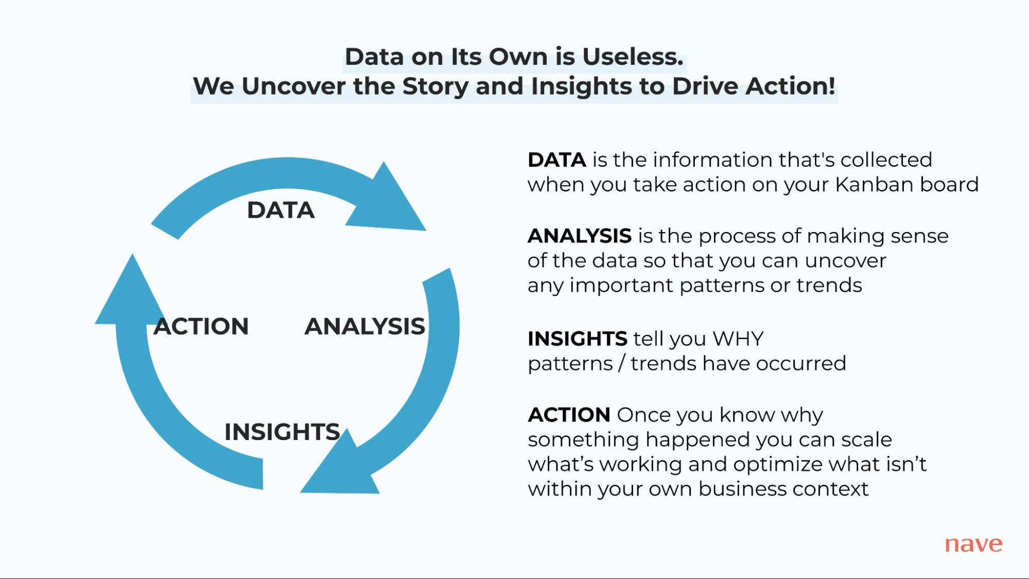
Step #1: Collect Your Performance Data
Data is the information that’s collected when you take action on your Kanban board – cards move from one state in the process to another, they get flagged as blocked, people assign themselves on the cards or they’ve been categorized using certain custom fields. These actions are captured by your Kanban analytical platform and they become your performance data.
For example, let’s explore what data you need to collect to be able to build your Cumulative Flow Diagram.
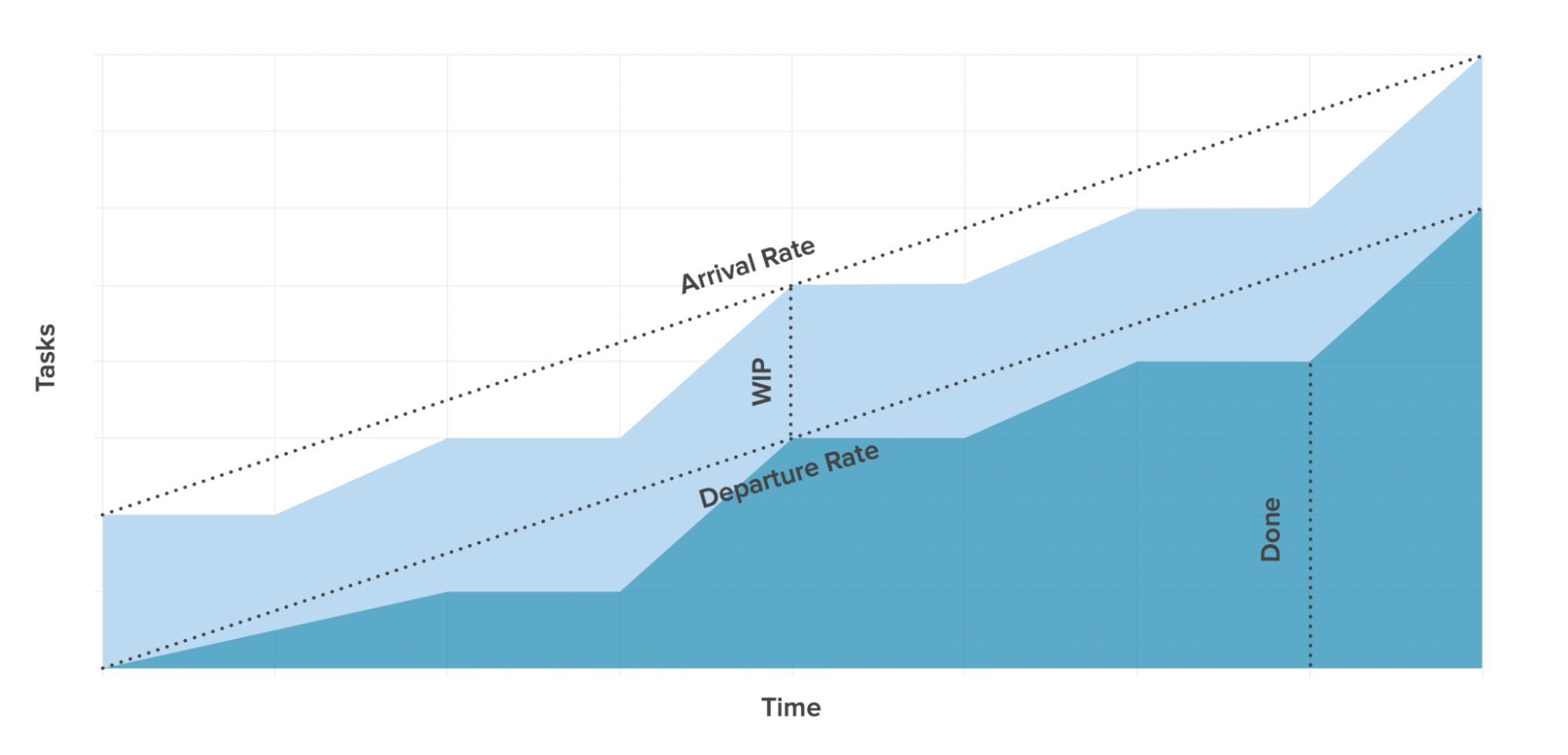
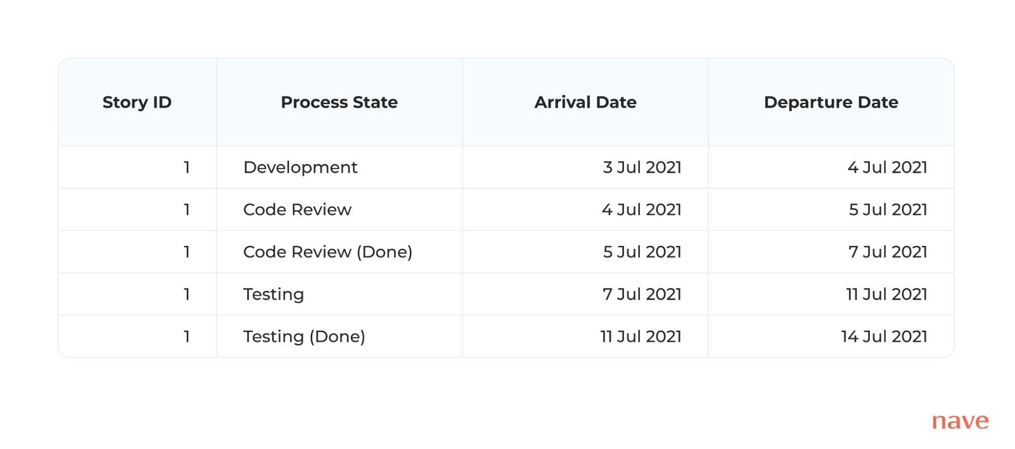
To structure a data set and create your CFD, you need to track when each task has moved through a certain process state. Collect a list of your task activities for each column on your board. Here, the end date of a previous activity will mark the start date of the following one.
Step #2: Perform Data Analysis
Now, once you’ve collected enough performance data, then you can build your Cumulative Flow Diagram and analyze it. Analysis is the process of making sense of the data so that you can uncover any important patterns or trends.
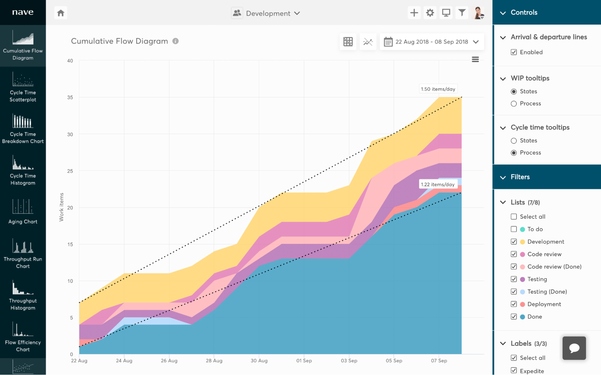
For example, looking into the Cumulative Flow Diagram above, we can see how the bands that represent work in progress states are increasing over time. This pattern is called “Differences in Gradient” and this is probably the most common Cumulative Flow Diagram pattern you will come across.
The “Differences in Gradient” pattern points to a mismatch between the rate at which your team starts new work and the rate at which they deliver outstanding work. Usually, the upper line of a band will be steeper than the lower one. This means that tasks are entering the stream faster than they are being completed.
When new work is arriving faster than old work is being completed, your work in progress (WIP) will increase over time. If your WIP is increasing, then the distance between the departure and arrival lines will be expanding. This means that the arrival rate is higher than the departure rate, and it denotes excessive demand – your team is struggling with the workload and their delivery speed is slowing down.
Step #3: Get Actionable Insights From Your Analysis
It’s not enough to just identify that those patterns have occurred. You need to take it one step further. You should connect the patterns and trends that you’re seeing on the charts to the decisions that you’re actually making.
You should be looking for the root cause of this trend. Why is your WIP increasing?
Of course, we are assuming the team setup hasn’t changed and the same amount of people are working for a similar amount of time. If you see this pattern and you’ve recently expanded your team, an increase in WIP across process states is completely fine, as there are now more people available to handle the workload.
However, if the size of your team is the same, you need to investigate further to search for other clues. Are tasks being pushed by the management, rather than being pulled by the team? Are there expedite work items that are constantly interrupting the standard flow of work? Is there a blockage in a downstream process state?
All of these types of things are going to play a role in what you’re seeing on the charts.
When you connect your business context to what you’ve identified in your analysis, then you’ll be able to determine why the patterns and trends have occurred. This is what we call an Insight.
Step #4: Take Action on Your Insights
Now, once you have an insight, then you can take the appropriate action to resolve the problem. After all, you now know what’s actually causing these deviations.

Little’s Law states that an increase in WIP will most certainly lead to an increase in your delivery times, too. Also, as more and more builds up in your work in progress, your team will start to multitask and switch contexts to keep up with the demand, ultimately becoming less efficient.
And there are certain Kanban practices that can help you tackle this pattern and stabilize your process.
Firstly, strictly enforce and adhere to WIP limits.
As stated in the Kanban Maturity Model, at maturity level 0, teams realize a limit to human capacity, a desire for relief from overburdening. They recognize that multitasking makes their work take longer to finish while causing unpredictable completion times.
It’s far better to “stop starting, and start finishing.” At this stage, it is crucial for you to understand that limiting work in progress helps you avoid multitasking and reduce the time taken to deliver work.
At level 1, teams start to apply WIP limits on a personal level, and at maturity level 2, organizations establish both team WIP limits and WIP limits across the entire system.
So, once you take action to resolve the impediments that hinder your performance, this is going to produce more new data. At this point, you start this whole cycle all over again.
Now, you have more new data to help you understand how your initiative performed. Gather the data, analyze it, get the insights and take action accordingly. If the initiative has achieved its goal, make the new approach of working a standard, by introducing it as an explicit process policy. If not, revert back to square 1, and troubleshoot the root causes that failed your initiative.
READING THE CUMULATIVE FLOW DIAGRAM
How to Recognize the Most Common CFD Patterns and What They Mean for Your Workflow
By following the 4-steps to leveraging your Kanban Analytics, you’ll be able to constantly run improvement initiatives and learn what’s working and what isn’t within your own business context. Effectively, you’re enabling an environment of continuous improvement.
As you introduce small incremental changes (that are safe to fail and easy to reverse), you build a system that consistently optimizes itself for better business outcomes. As one small win leads to another, you’ll be able to achieve a massive improvement in your performance.
If your delivery workflows don’t produce the business outcomes you’re striving to achieve and you’re willing to explore the proven roadmap to optimize your systems for predictability, I’d be thrilled to welcome you to our Sustainable Predictability program!
This post is republished with permission from Nave. Nave uses data from TopLeft to make agile charts for analyzing workflow efficiency and identifying areas for improvement in your team. Learn more here.